Design Style Guide
Set your visual direction before anyone starts designing.
Visual identity is not decoration.
It is a system of signals.
Color, typography, spacing, and imagery shape perception long before someone reads a sentence.
This guide helps you set visual direction with intention, not impulse.
A well-defined direction reduces revisions.

Visual Energy
How should your brand feel at first glance?
Calm · Confident · Bold · Premium · Minimal · Playful · Technical · Warm · Structured · Experimental
Should your design feel light or dense?
Open or compact?
Quiet or expressive?
Describe the energy in 3–5 sentences.
Color Direction
Before choosing a palette, define:
• Warm or cool?
• High contrast or soft contrast?
• Neutral base with accents — or color-driven?
Tools:
Coolors — https://coolors.co
Ease: ★★★★★
Use when you want quick palette exploration.
Avoid if you rely only on random generation.
Adobe Color — https://color.adobe.com
Ease: ★★★★☆
Use for harmony and accessibility testing.
Avoid if you want instant answers without understanding relationships.
Contrast Checker — https://webaim.org/resources/contrastchecker/
Ease: ★★★★★
Use to verify readability and accessibility.
Never skip this.
Typography Direction
Typography defines authority.
Serif or sans-serif?
Modern or elegant?
Neutral or expressive?
Most brands need two fonts. Rarely more.
Tools:
Google Fonts — https://fonts.google.com
Ease: ★★★★★
Safe and web-ready.
Avoid mixing too many styles.
Fontpair — https://www.fontpair.co
Ease: ★★★★☆
Use for safe combinations.
WhatTheFont — https://www.myfonts.com/pages/whatthefont
Ease: ★★★☆☆
Identify fonts from images.
Check licensing.
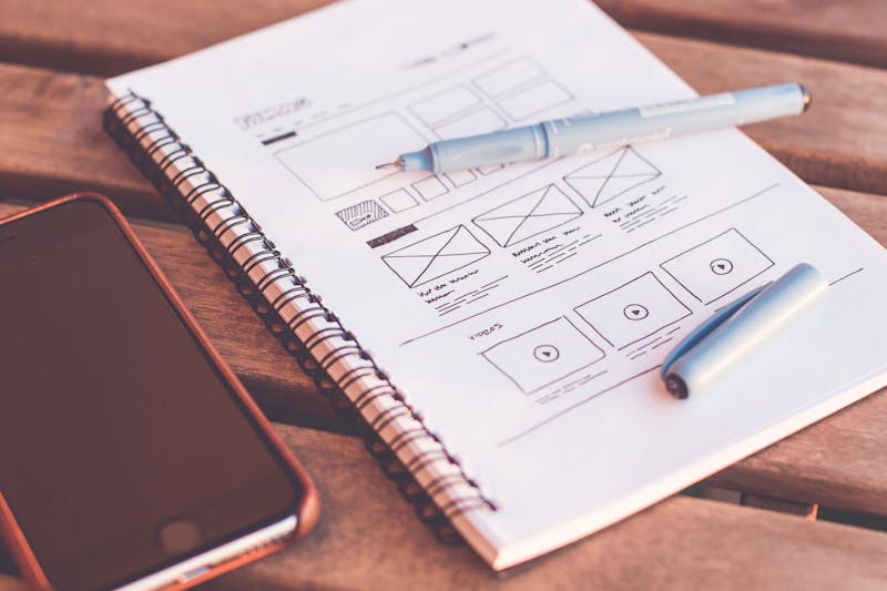
Layout & Structure
Design is structure.
Hero-heavy or compact?
Image-led or text-led?
Modular or narrative?
Sketch before you design.
Imagery & Mood
Real photography or abstract?
Studio light or natural light?
People-focused or product-focused?
Tools:
Milanote — https://milanote.com
Ease: ★★★★☆
Structured moodboards.
Pinterest — https://pinterest.com
Ease: ★★★★★
Broad inspiration.
Avoid trend overload.
Pexels — https://pexels.com
Ease: ★★★★★
Free stock photography.
Choose intentionally.
What to Avoid
• Copying competitors.
• Mixing too many visual styles.
• Prioritizing trends over strategic direction.
Design should amplify positioning.
A well-defined visual direction reduces friction and strengthens credibility.
Design is structured perception.
Tip: In the print dialog, choose 'Save as PDF' to download.